Mobile design could be easy for a few. But ask even
expert developers, and they would tell you that while designing for mobile can
be easy, mobile debugging is not. But with lots of tools available today to help
you debug even hard to notice errors, mobile debugging is getting easier too.
This article looks at what Firefox has to offer here in comparison to its
competitors.
Testing with
Firefox
When you test with Firefox, It is good to start
with the responsive mode as it allows you to adapt the layout to your mobile
screen size. But the question arises, how do you test your responsive design?
The usual response has been, ‘Let’s try resizing the browser window’. But
experience proves that it is neither practical nor precise.
Here is where the Responsive mode of Firefox comes
to the rescue. It is called the responsive design view in Firefox 15, and has
been built to specifically test the mobile version of your website. Trying to
find out where it is located?
You can find it in the web developer submenu in
Firefox’s main menu. There, go to the responsive design view entry. You can
alternatively use the keyboard shortcuts to reach there.
Resizing the
view
When you activate the responsive design view,
Firefox resizes the view. But the window remains unchanged. For that, you will
have to use mouse controls on your right and bottom corner of your window.
Alternatively, you can use preset list at the top that has under it many
classic resolutions and if you can find what you are looking for among them,
you are also free to define your own resolution by editing the current selected
size.
Debug with remote
debugging
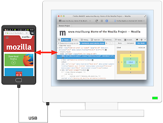
Though the responsive design view allows you to
take screenshots of what you’re viewing, it cannot replace a real Smartphone.
This is where remote debugging is of great help as it allows you to access the
developer’s toolbox for mobile websites.
All you need to do is just open the toolbox and go
to the ‘settings’ panel where you will find the ‘enable remote debugging’
option.

No comments:
Post a Comment